What's new

tym challenge

Man. A lot of these entries look like somebody spent 10 minutes in photoshop playing with layers and opacity and that's about it. Maybe some clone stamp/blur tools, heh. You guys have to remember the image is going to be used for a TATTOO so all that little detail stuff doesn't matter, and/or won't translate to skin well... the third image by calijokerstyle is probably the most usable one in here right now imo. Hopefully we get to see more stuff like that :)
 
CD jr gotta consider what looks well on your skin color. saw a nice white and red logo in this thread but that would only be good if you had jokers skin lol. also I saw a shady red logo, pretty nice but if you don't look closely its gonna look like a scar or like somebody beat you up the other night.
 

Johnny2d

Xbl: Johnny2Die
I almost forgot two things!!!

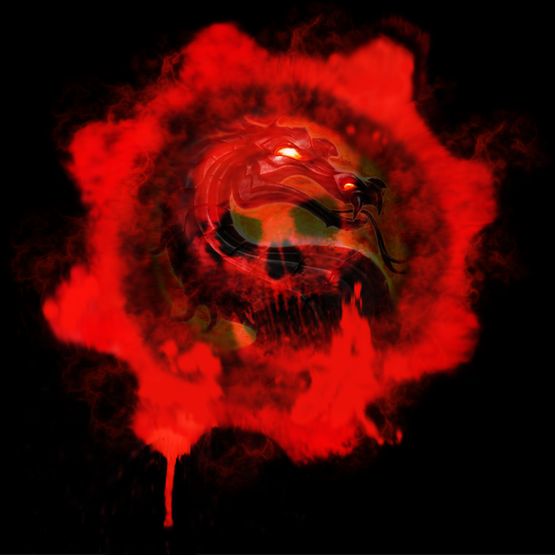
1. I prefer a more clean, more simple silhouette, so I drew from the original MK dragon rather than the new mk9 logo. After a bit of drawing I realized, CD jr has that character loyalty for jax, Jax got dat armor, I should use the armor dragon from the mk9 logo. So the illustration in my post is a combo of both dragons, and hopefully has more sentimental value for the one getting the tattoo.

2. I kept the texture in the realm of possibility for a tattoo artist, although I fully expect that the artist that CD jr uses can modify the texture to suit their ability, they can easily add more or less depending on what they are comfortable with/ what CD jr wants to spend. Also, all the texture in this is DRAWN, so it can be tattooed, and the design works even without it in silhouette.
 

Gimmick

Noob
Whats the idea?
It's hard to explain but it's the logos corner to corner with the same style surrounded by tribal symbols all connecting synonymously Also, the color is like a red fading to black.​
I copy and pasted some pics for a ROUGH visual.​
 

Johnny2d

Xbl: Johnny2Die
It's hard to explain but it's the logos corner to corner with the same style surrounded by tribal symbols all connecting synonymously Also, the color is like a red fading to black.​
I copy and pasted some pics for a ROUGH visual.​
Yeah, I could see that working well. Get some sharpees and draw it up ;)
 

Johnny2d

Xbl: Johnny2Die
This is legit. I think it'd look better in red, though.
Thanks Altaire :) I can make it whatever color. I feel that good Designs/Logos should look good in black and white first, and inverse, then of course color can be added no problem.
 

Altaire

Noob
Thanks Altaire :) I can make it whatever color. I feel that good Designs/Logos should look good in black and white first, and inverse, then of course color can be added no problem.
Makes sense. I can dig it.

What I think would be really hype is if you could make the dragon look skeletal, representative of the skull in the Gears emblem. The way I'm envisioning it looks fucking badass. It might be kind of difficult to translate into a coherent design, though.
 

AK Gookus

Slant-eyed Nightwing
Are you only looking at the Red Omen and MK dragon symbols? Or can the other symbols like Dog tags, COG wings, Locust 4 square plot, Carmine head. And cute thing is it could be KOG...