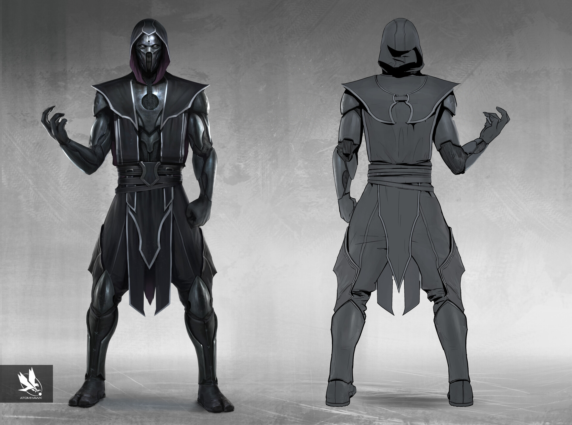
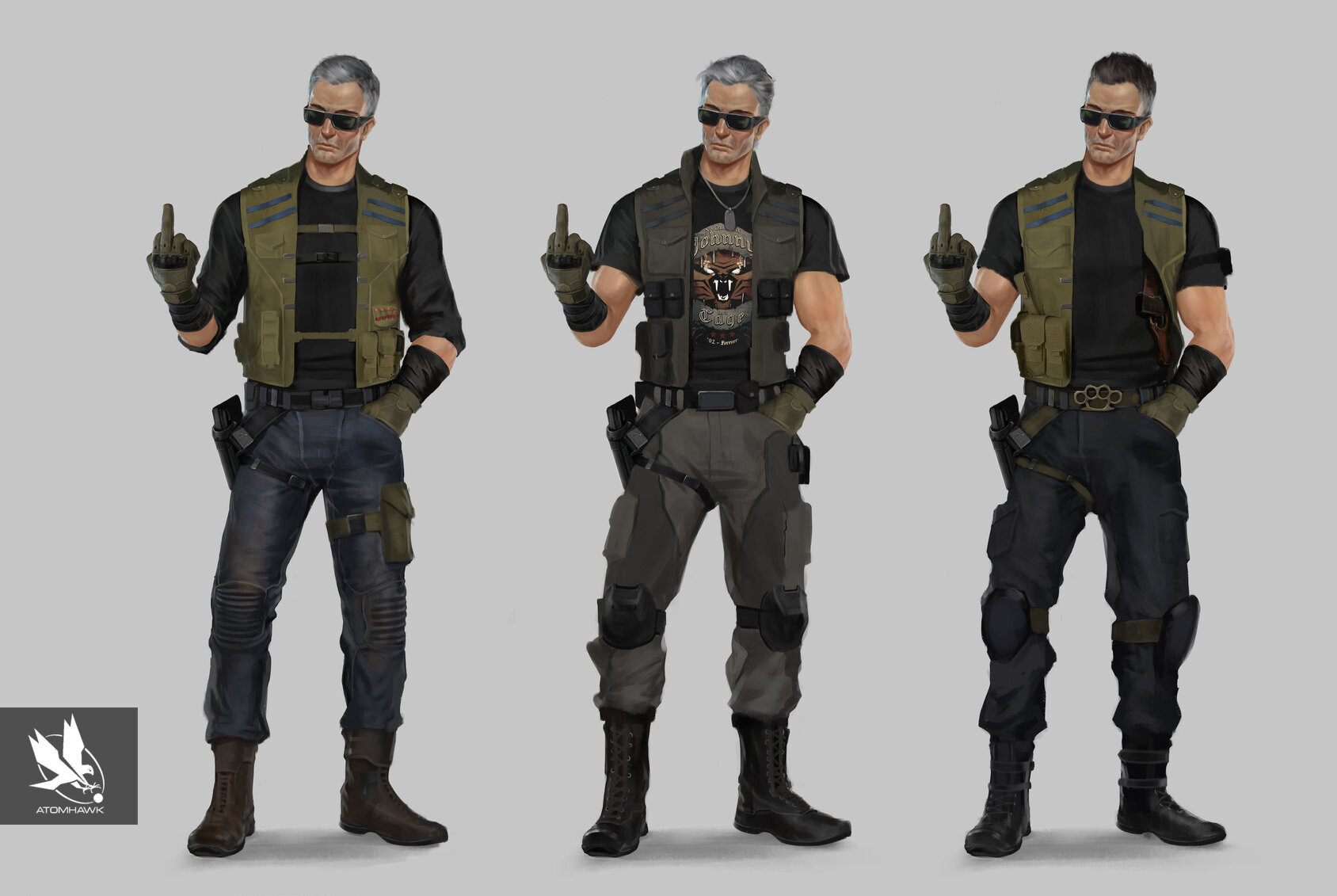
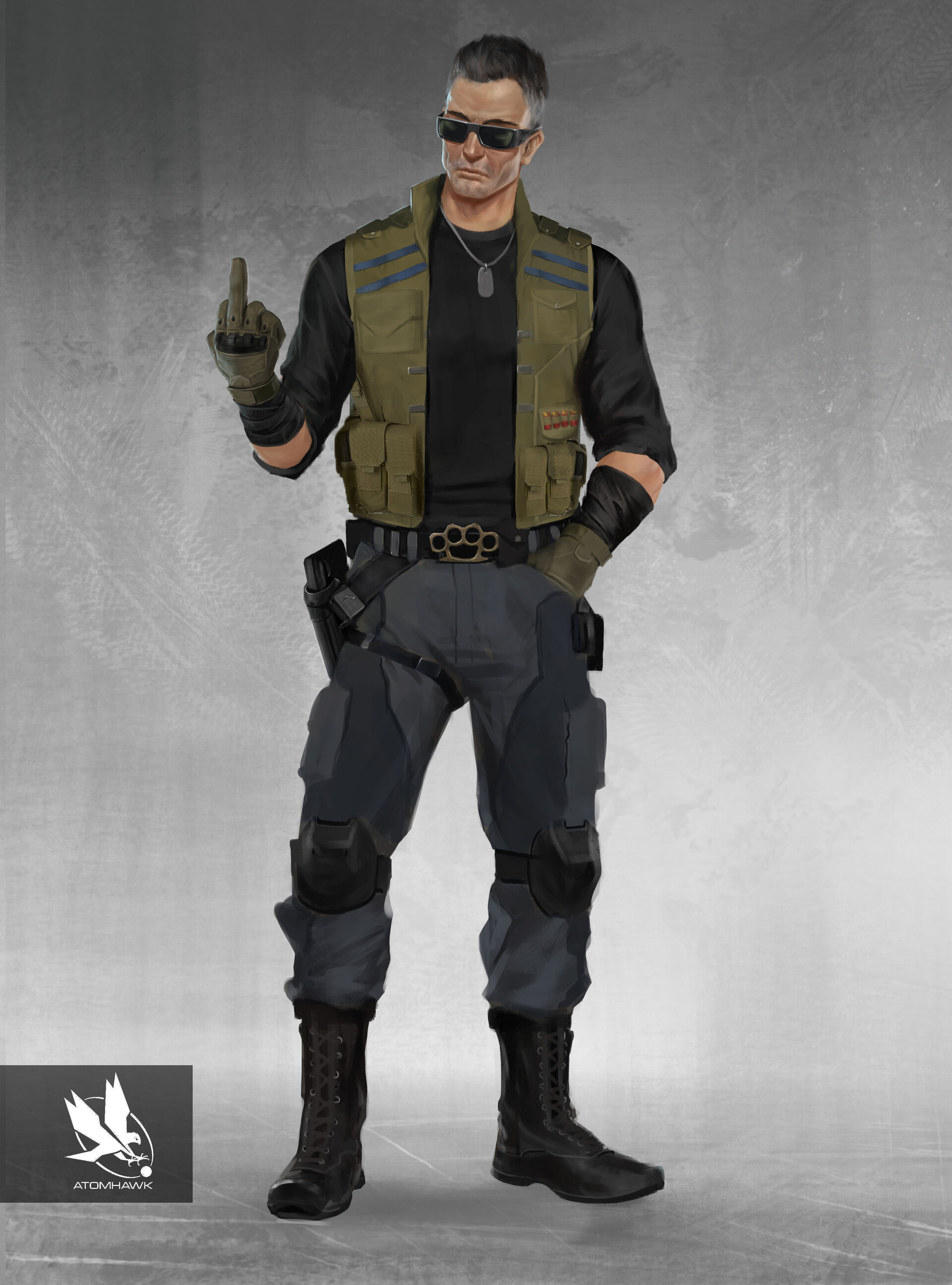
Tanya-Fan-28
TanyaShouldBeInMK11
View attachment 14660
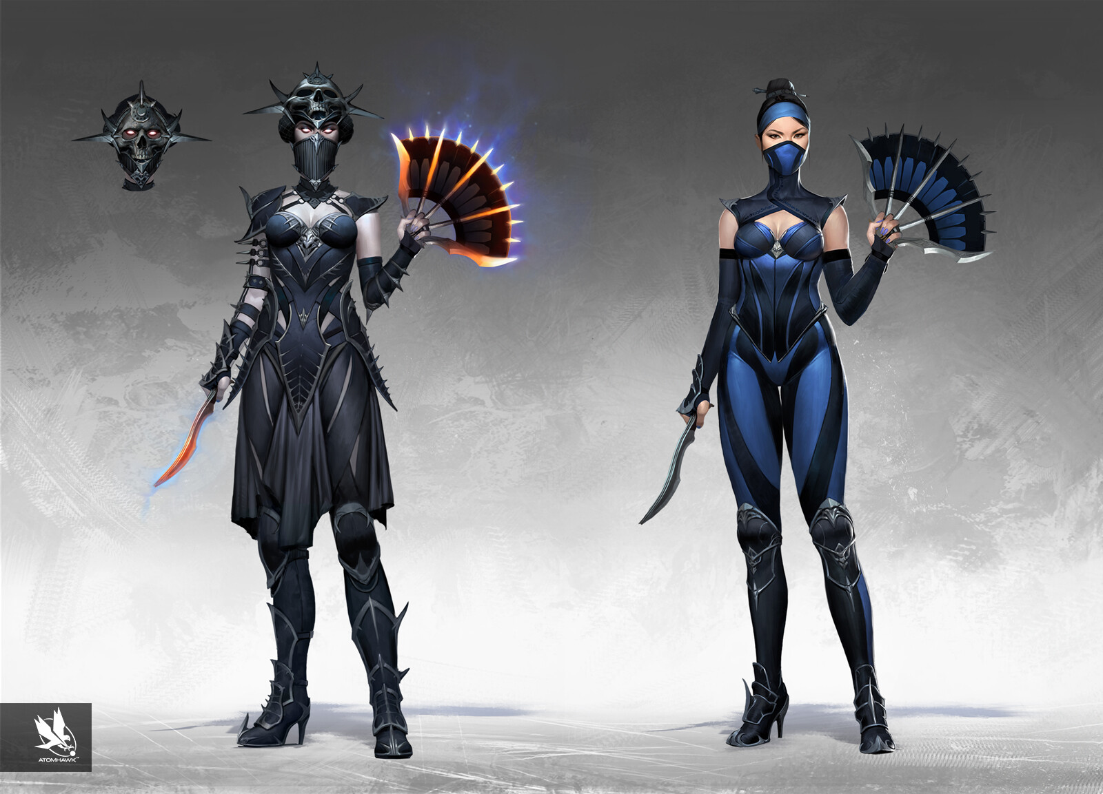
Why didn’t we get the bottom row second design for Kitana.....
Top row: 2nd and especially 4th. The head piece looks so extravagant and menacingly beautiful. She looks like a revanent boss instead of the revanent pawn we got in game.View attachment 14660
Why didn’t we get the bottom row second design for Kitana.....
Bottom row: The 2nd for long hair and modernized classic look and the 5th for the hood. The navy blue looks like a proper evolution from baby blue instead we got the ugly black and royale blue stripes. I bet the artist mentality was like "Well she is a royale princess, it only makes sense to give her ROYAL blue".
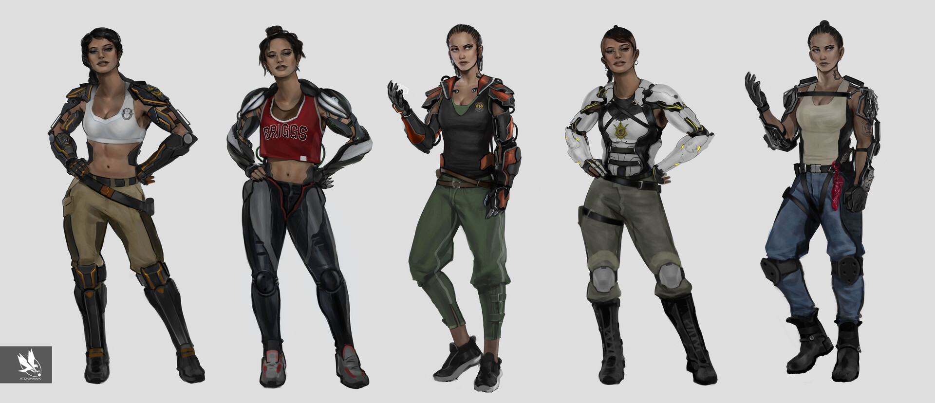
I love the hairstyles in Jacqui's concepts. Its so 90s yet modern about it. On the top row: the 2nd for that spectacular sillhuiate of the red dress and robot arms and 3rd for the black dress. I'm happy that the 4th made it into the game, the design is the best in mk11. Bottom row: 2nd for the cute red shirt that says Briggs. K Jacqui looks good in redI really really hope some of those will make it in DLCs. They look beautiful and especially creative. I’m not sure why Cassie got an astronaut suit when she could have gotten any of these. And Jacqui? STUNNING yo. I’d pay for a DLC pack of those.
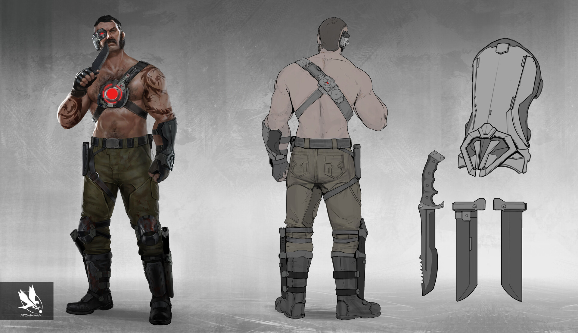
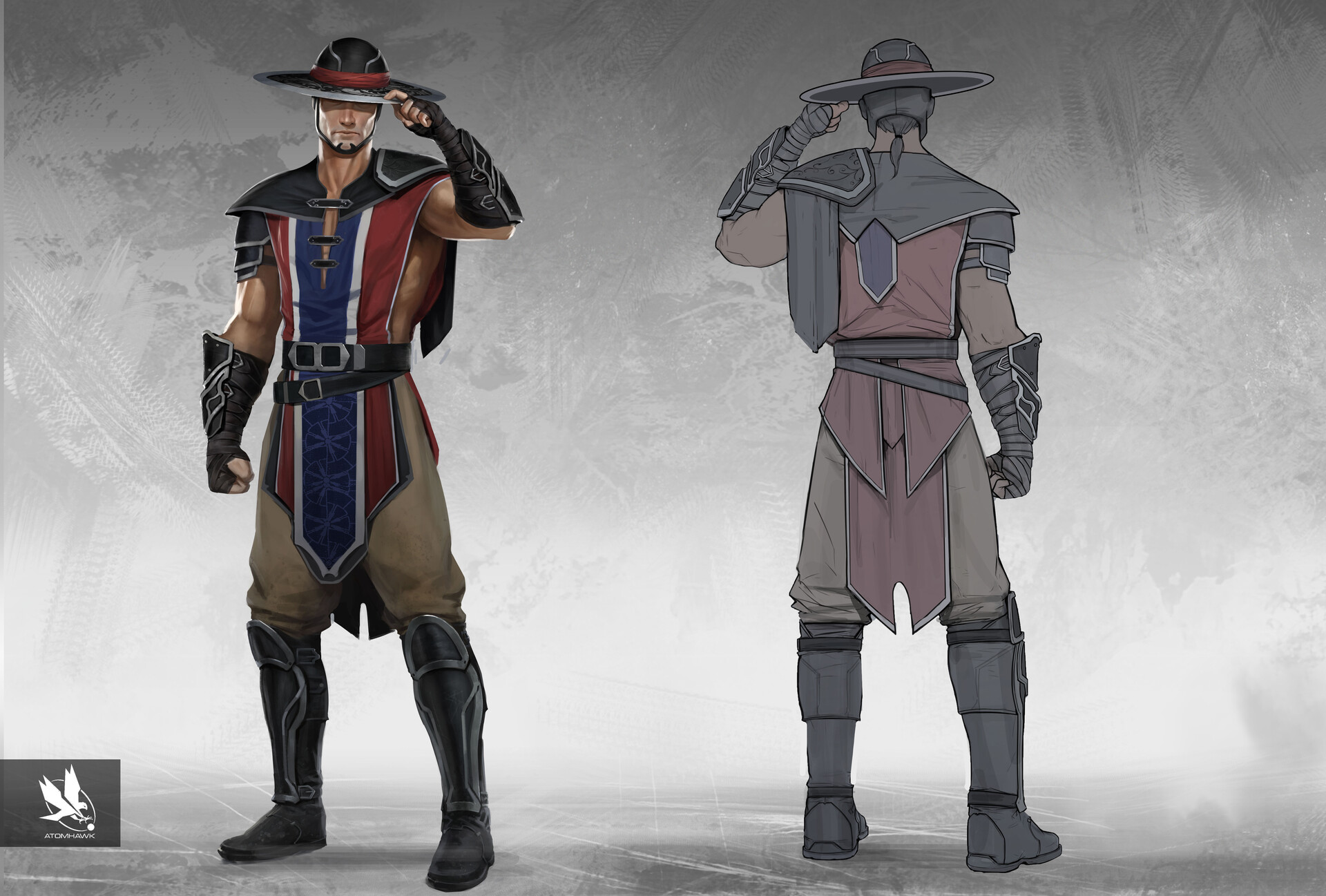
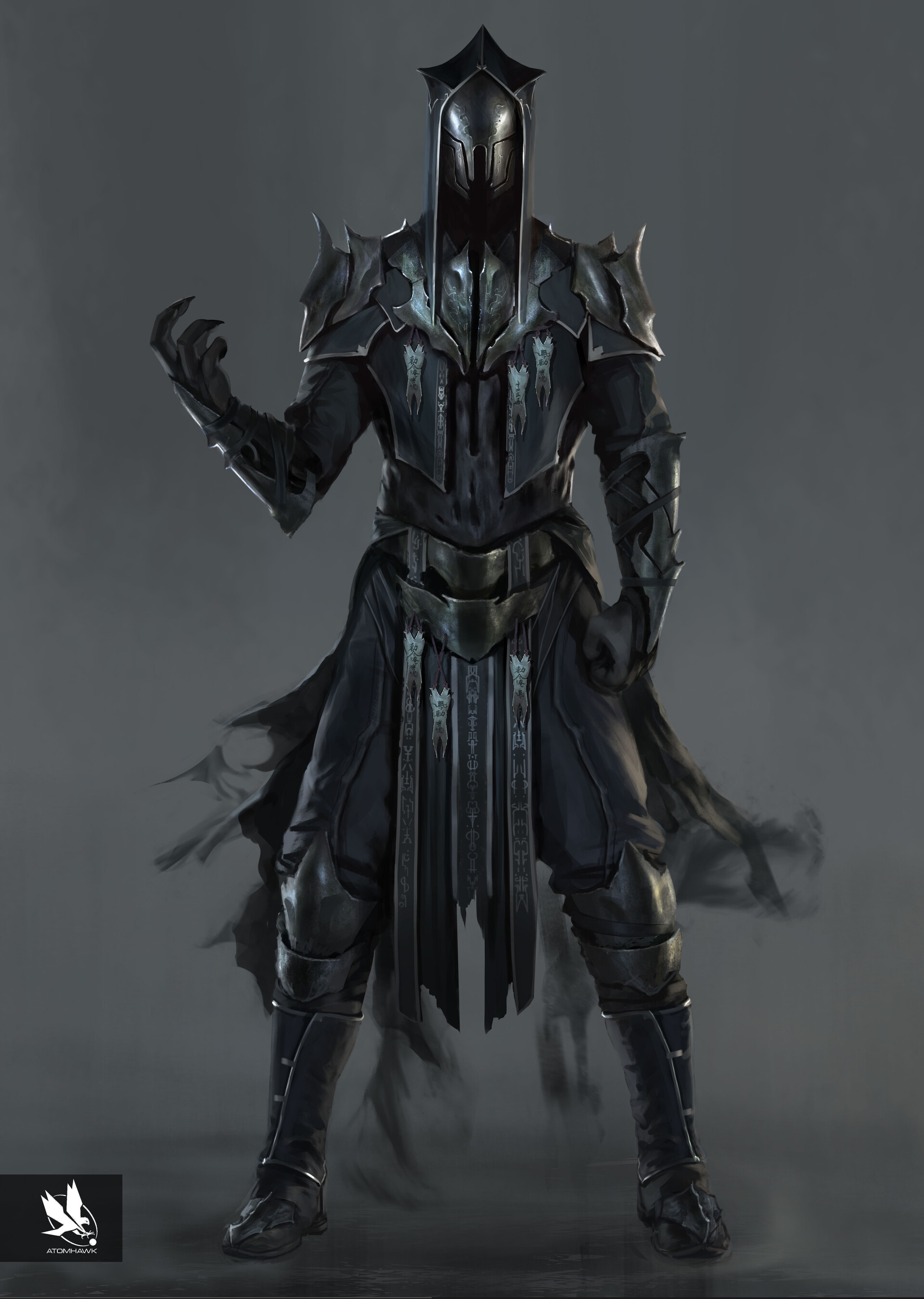
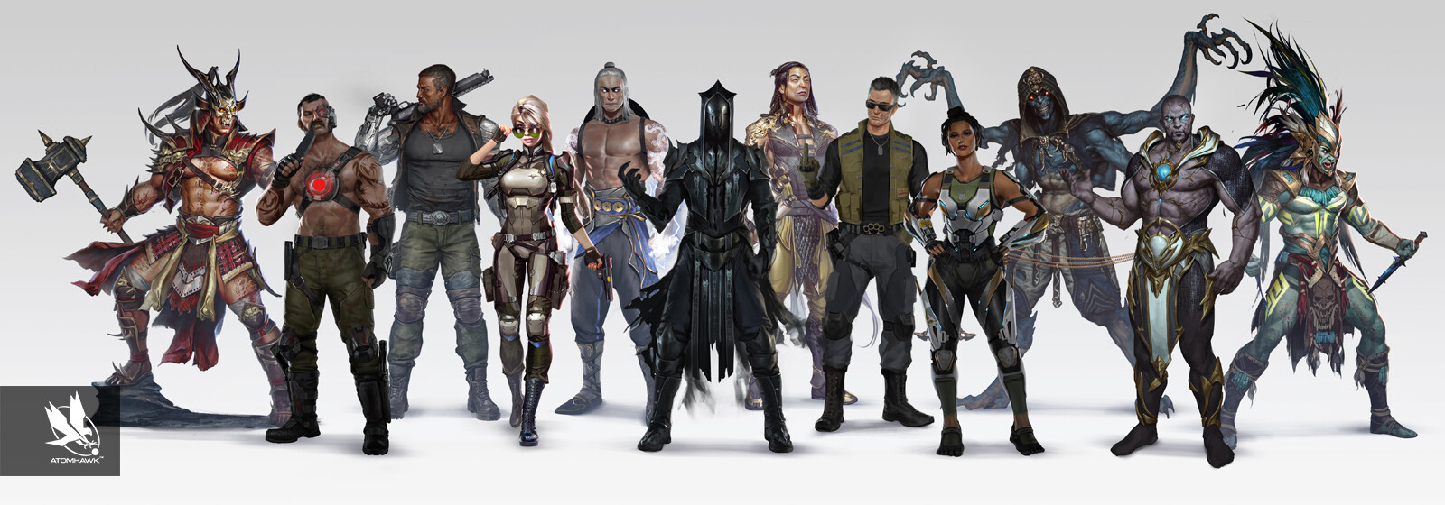
View attachment 14407
View attachment 14408
View attachment 14409
View attachment 14410
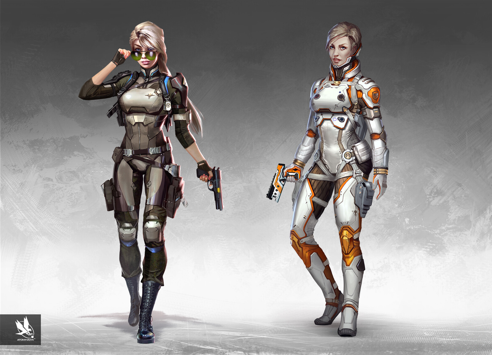
So they saw this concept art and said ‘nah let’s go more boring, like Andromeda boring.’ I’m mad.

Cassie: I like the sillouette of the 3rd one, a lot better than that oversized collar we got in the game.
Jade: Tbh I already like Jades in game design in MK11 but if I had to pick, the 2nd for that "high-set tight french braid". Its a timeless hairstyle.
