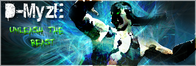
I'd say that it's a good first signature. If I may, I'd like to offer you some suggestions:
1) The render's colors are way too burned; those patches of black and static really take away from what could have been a great signature. Try not to set layers to Color Burn or Linear Burn and try to lower the opacities of overlapping layers. The render is an important part of the signature and it shouldn't be covered with too much stuff.
2) Your render needs to blend in more with the background. It looks like you just pasted Nightwolf on to a pre-made background; that is never good. Try using Photo Filters to blend the render more with the background. There are other techniques out there to blend render with the BG such as brushing and feathering but those are a bit more advanced.
3) Your green text just seems out of place. I'd either get rid of it or change the color.
4) The white text is too big and it seems to, again, just be pasted unto the sig. Try decreasing the size of the font and blending it more with the signature using the text's blending options.
5) Set the border to 1 px or set its blending mode to overlay - the border just doesn't seem to fit with the signature.
6) Head on over to the "Signature Resources Thread" in this subforum and check out TyrantRave's and my sigmaking tutorials. They are made for beginners and are very easy to follow.
