What's new

Mortal Kombat Legacy Series 2: Tancharoen Tweets New Teaser Images

STORMS

Co-founder
Founder
Premium Supporter
With the last series being a huge sucess Mortal Kombat Legacy series 2 is sure to be even better. Although, a few characters will now be played by different actors as well as new characters joining legacy as others leave... Kevin Tancharoen has recently tweeted some images that will make you hungry for more. They have recently began filming the second series and two characters we can expect to see are Liu Kang and Kung Lao.

The last few days have consisted of Kevin tweeting some very teasing images of a newly designed 'Mortal Kombat' dragon logo as well as what appears to be Liu Kang and Kung Lao's hat.

mklliu.jpg
Something to note here would be Liu Kang's appearance. In this image, he definitely does not look as 'good' as he should... perhaps some evil blended in. The possiblities are quite endless when you imagine what it'll be like when he's fighting.

mklkung.jpg

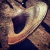
Kung Lao's iconic hat is only missing that razor sharp edge. What could be in store for him? So far, so good!

mkllogo.jpg

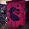
Mortal Kombat Legacy Series II Dragon Logo

Source: KTANCH
 
+1

Not impressed. I mean, how hard would it have been for them to draw the acual logo? They are already using the trademark wtf.
Uhm.. Probably not hard at all, they're doing it most likely based on theirs and not yours.. Also likely considered the actual MK logo and may even change it.. WTFOMG
 

Dramatica

Forecast calls for missiles
the logo is obviously designed to look more primitive. wtf people grow a fucking brain.
This. I am disappointed to see so many people hating on one man's creative vision. Try thinking outside your little box for once. Personally I would have been shaking my head if it WERE the exact same effing dragon logo.
 

GLoRToR

Positive Poster!
Uhm.. Probably not hard at all,
My point exactly.

they're doing it most likely based on theirs and not yours..
I don't have a Mortal Kombat logo design. The trademark comes with the logo design which is the brand by which the merchandise is recognised. Instead, we see a piece of red cloth with a ballpen-drawn dragon on it that's got three holes cut into it by scissors. Weak.

Also likely considered the actual MK logo and may even change it.. WTFOMG
What?
 

Pig Of The Hut

Day 0 Phenomenal Dr. Fate and Darkseid player
It's a different take on the MK universe and a different take on the logo, no problem here.
This. I am disappointed to see so many people hating on one man's creative vision. Try thinking outside your little box for once. Personally I would have been shaking my head if it WERE the exact same effing dragon logo.
the logo is obviously designed to look more primitive. wtf people grow a fucking brain.
Smart ^^^

Its a different take - Meaning NOT THE SAME - meaning WE DO DIFFERENT THINGS - meaning WE WILL CHANGE STUFF, gtfo . If you dont like it then thats cool its your opinion but if the dragon means that much to you then go rent Moratl Kombat Annihilation because they used the original dragon in that movie and because they used it the movie was perfect.
 

BillStickers

Do not touch me again.
you also have to take into account 1) context and 2) chronology. in this fictional universe, would the first logo really be the stylized, developed version that we now have in the 9th installment in MK? would Outworld or Shang Tsung's island really have dedicated signmakers that can perfectly recreate a logo? no, these signs were most likely created ad-hoc by some random person (think cave paintings, etc.). if you look at any logo that has developed over time, they never start out as refined (or even anywhere near the same).
 

GLoRToR

Positive Poster!
Sure, we can just blindly accept that with a low budget, taking a ball pen and drawing a dragon on your old scarf is the way to create original atmosphere.
 
Sure, we can just blindly accept that with a low budget, taking a ball pen and drawing a dragon on your old scarf is the way to create original atmosphere.
WTF are you talking about blindly, Lol. This isn't some brainwashing media stunt, it's a fucking logo, that's different. OG MK logo was backward it's not even the logo everyone's loves so much. This one looks bad ass.
 

Temp

Salmon. Otters. The Bringer.
I don't think the "more primitive" description is applicable. The difference in the two logos lies more in the drawing style than the type of dragon in the logo (which is mostly the same). Or perhaps you guys were referring to the drawing style to begin with?

But hey, if you like the new logo guys, that's great. All the aggression in here seems unwarranted, though.
 

Under_The_Mayo

Master of Quanculations
TEH LOGO IS DIFRENT!!!

I expect the logo to be the same exact logo designed in 1991, and I also expect sonya to look like a Jazzercise instructor with a head band and spandex pants up past her fuckin bellybutton.

This is why we can't have nice things. The internet has ruined everything.
 

Konqrr

MK11 Kabal = MK9 Kitana
I loved the original Legacy series and even own it on BluRay. I can't wait for this season.

EDIT: logo is awesome, fuck you guys.