


Xcalibur13
Noob
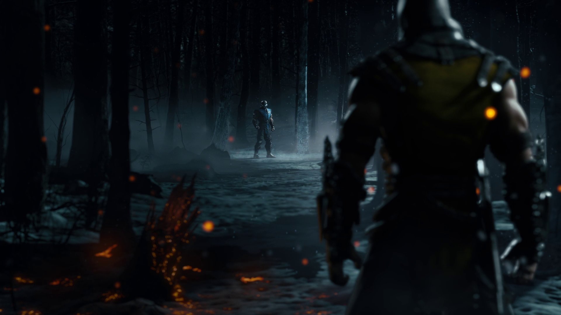
MK9's graphics were gritty and pretty realistic but not to the point of being bland. They've always gone the more realistic route, anything other than that just wouldn't feel right.Some people complain about the character models being ugly. I don't think they're bad, but I think it's more some of the backgrounds which are rather dreary. One thing I like about Japanese-made fighters like MvC3 and Soul Calibur IV is their aesthetic design; they opt to have visuals that flourish with bright colors. While I'm used to MK being gritty, it appears to be a slight turn-off when you look at how nice the other games look in comparison. It's realistic, but maybe too much.
")