What's new

About the next MK artstyle(Bringing back the colors?)

Slymind

Noob
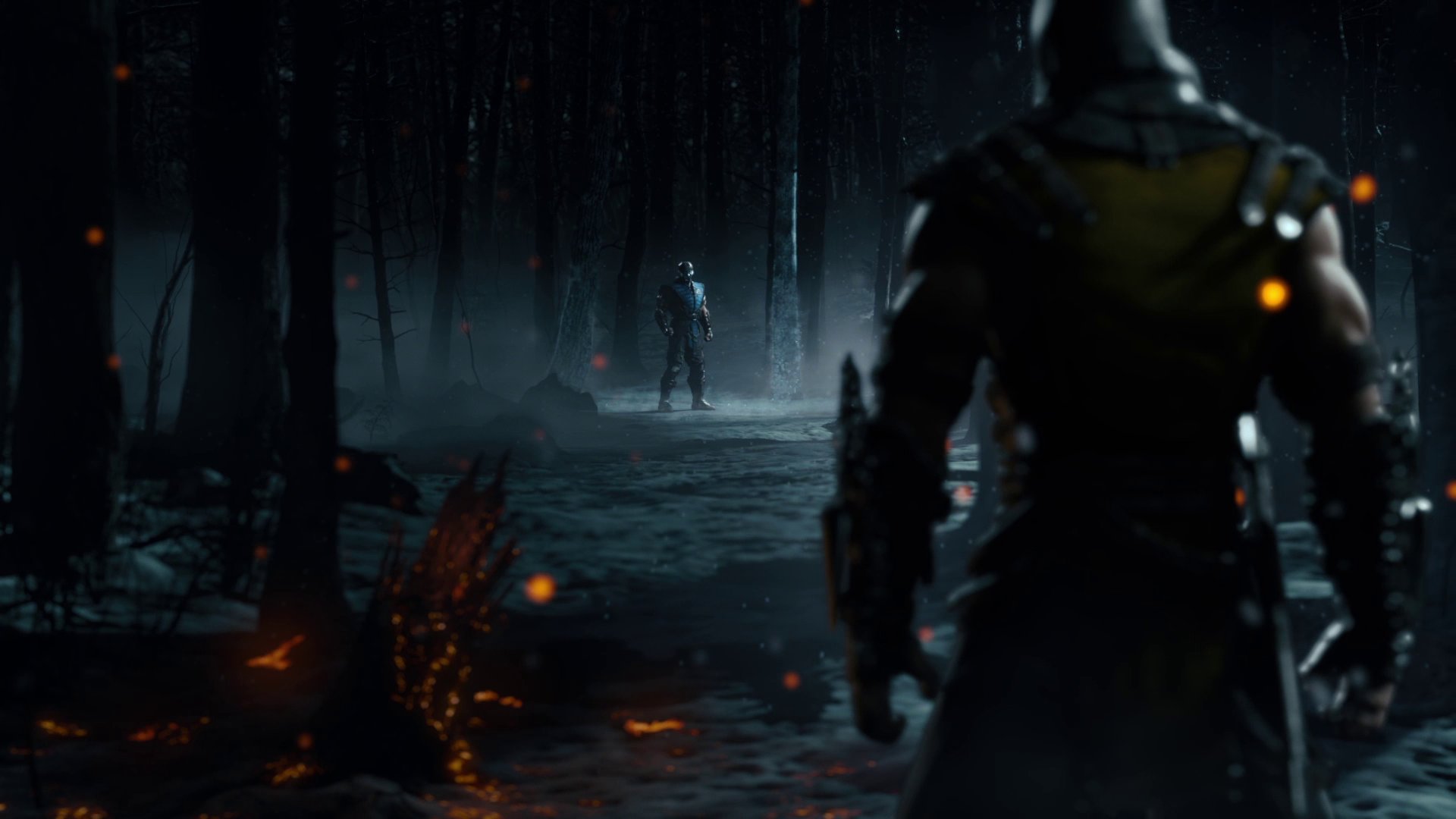
From MK9 to X we saw a transition from a colorful and even somewhat cartoonish style for a more dark toned art direction, i'm not here talk about graphical fidelity, because X obviously is ahead in that department. However, after seeing Injustice 2, i must say i would like them to stick with the vibrant colors similar to what we currently have in Injustice 2 and to a an extent to MK9.

The darker atmosphere can work for MK's setting too, but, i do think think that the colorful approach manages to better capture the charisma that the series had in past games, also, the fantasy elements which are a big part of the universe mix well with strong colors imo.
 

NothingPersonal

Are you not entertained!?
I loved the colors in the renders for MKX, dark, yet full of contrast. Ingame, though, not so much. It'd be awesome if the color palet was like those renders.
 

Jhonnykiller45

Shirai Ryu
We have to remember MKX came after IGAU, which was a particularly drab-looking game. I'm sure MK11 will follow in a similiar path to Injustice 2 with its artstyle.
 

Braindead

I want Kronika to step on my face
Playing a match between ninjas in MK9 with classic costumes was so satisfying visually because of the colorfulness. They botched it in MKX.

I don't particularly like what they did with the lighting in Inj2 because some gear looks great on some stages but awfully dark/dull on others. I hope they make it more consistent in 11.

Sent from my Quantum Computer using TYM Quantum App
 

Sage Leviathan

I'm platinum mad!
I like how colorful Injustice 2 is. I'd love to play the next MK in such a filter.

Related: one of my favorite color schemes comes from Deception, but that's probably in conjunction with a thematically darker soundtrack and story.
 
We dont need to choose between dark auto style and vibrant colors. See Bioshock. They just need to not drown the colors under grey filters.

I dont agree with going back to kampy klassic kostumes just to tickle nostalgia.
 

Slymind

Noob
We dont need to choose between dark auto style and vibrant colors. See Bioshock. They just need to not drown the colors under grey filters.

I dont agree with going back to kampy klassic kostumes just to tickle nostalgia.
Character design and outfits is not what i meant to discuss, MKX was a step up on that department specially for female characters.
 

Tanno

The Fantasy is the Reality of the Mind
We dont need to choose between dark auto style and vibrant colors. See Bioshock. They just need to not drown the colors under grey filters.

I dont agree with going back to kampy klassic kostumes just to tickle nostalgia.
I would suggest that HDR be implemented there. This would truly be a graphically epic game. Now, all the consoles, even GPUs, support HDR, and I want this implemented. I don't like the pseudo dark color (which is the dark gray one in Noob Saibot's kostume). If they implement HDR, it would be like a step closer to reality.
 

Jynks

some heroes are born, some made, some wondrous
I'm pretty sure the driving force behind the darker colour was a push, maybe from WB, to make the game less controversial. The darker scheme, meant the blood was nearly black.. rather than crimson red. It is well known that reducing the red colour in blood can squeeze past ratings. Horror and action movies have been doing it for decades. MKx had some awesome fatalities, but none felt as gory as MK9... yes even things like Ermac's... the dark colours, the less bright red.. imagine some of them if it was all bright red. MK9 was more "gory" and was also banned a lot more places.
 

jcbowie

...more deadly than the dawn.
A little off-topic, but imo it'd be cool if they reverted to MK9 standards in terms of showing progressive damage on your character over the course of the match. In MKX everyone just looks sweaty and tired by the end, but I remember stuff like Kabal especially in MK9 where you could see chunks of the mask coming off and there were really bright, bloody injuries.
 

Blade4693

VIVIVI
For f**** sake yes. MKX was so boring and grey.

The old MK games were still dark, but had some damn color in them. Maybe it's my impression as a kid but MK1,2 3 etc. had a dark atmosphere but there was no lack of color. Even MK9 had a mystic and darkish vibe.

MKX was bland as hell to look at. Throw on top of the boring ass special forces focus and you have a boring ass looking game. I love MK but I hate how MKX went with the color pallet and most of the stages.

A lot of MK's identity for me is the weird a** stages. MKX had a few like Kove, and Qaun Chi's place but overall it missed the mark. Kotal's level and the SF base are just ass. Even the Bank and Street stages from the MK3 series are better than those lol

(I ranted a bit here, my bad lol)