9.95
Champion
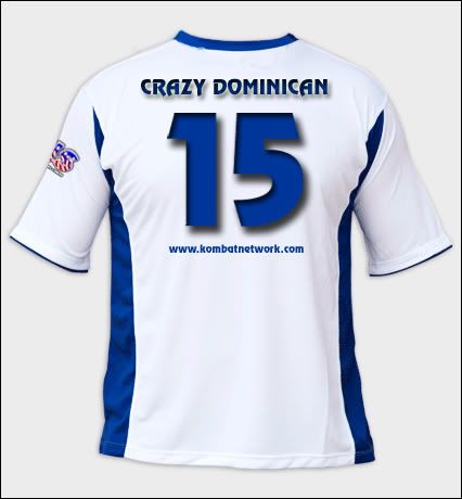
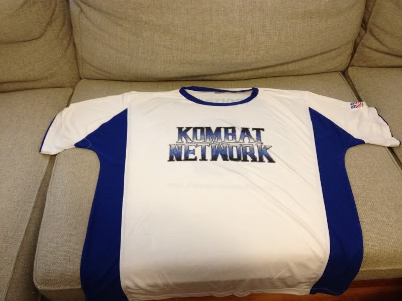
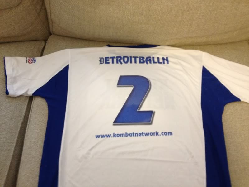
So, this is the final design, with some slight alterations here and there, but this is what both
CRAZY DOMINICAN and DetroitBalln313 will be wearing!

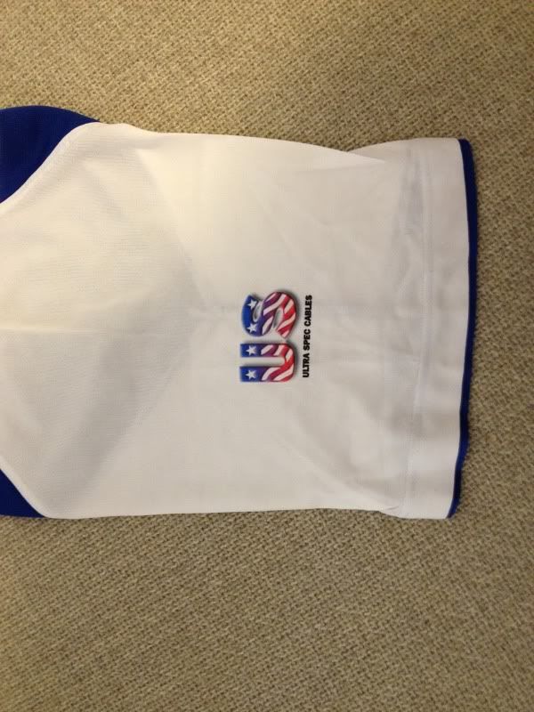
And the Sleeve
CRAZY DOMINICAN and DetroitBalln313 will be wearing!


And the Sleeve






 only thing i think would make it look better (imo) is if the back had the same gradient/theme/font/etc as the front
 . XL #13.